Big Bites
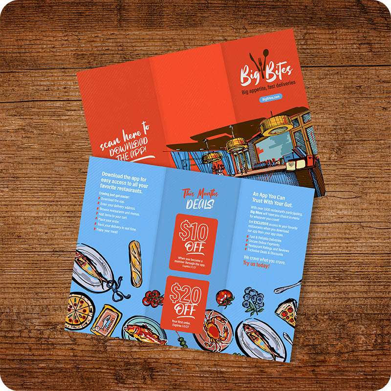
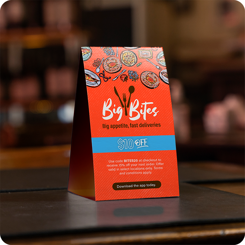
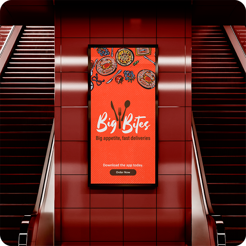
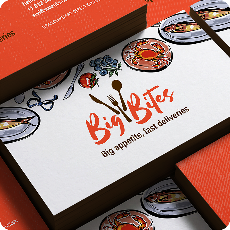
Big Bites, a subsidiary of Swift Sweets, focuses on traditional food delivery, offering a broader range of dishes beyond desserts. I wanted this brand to have its own distinct look and feel, setting it apart from the main brand. To achieve this, I leaned into a more urban-inspired aesthetic, incorporating hand-sketched illustrations, vibrant colors, and city-inspired elements to give the brand a sense of personality and energy.
Since Big Bites caters to a wider variety of food options, I felt a rich red would be a fitting primary color. It helps establish a strong connection to the food industry while giving the brand its own identity. However, I still wanted to maintain a subtle visual connection to Swift Sweets, so I carried over the light blue (granted with a slight shade change) as a complementary color. The contrast between the two creates the bold, eye-catching pop I was looking for while helping tie the two brands together.