Swift Sweets
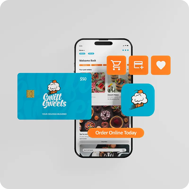
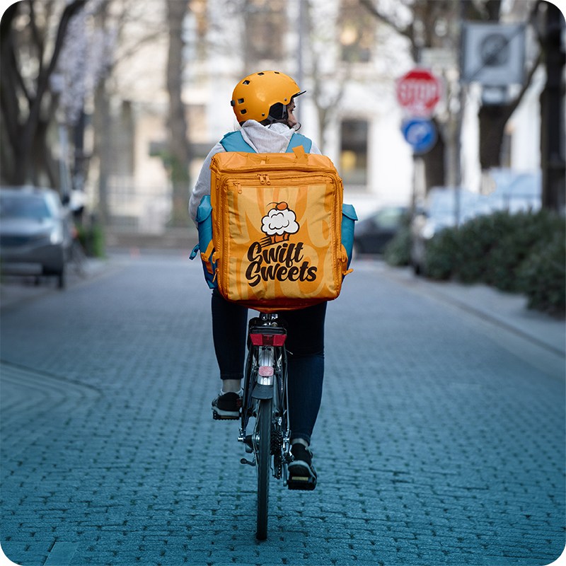
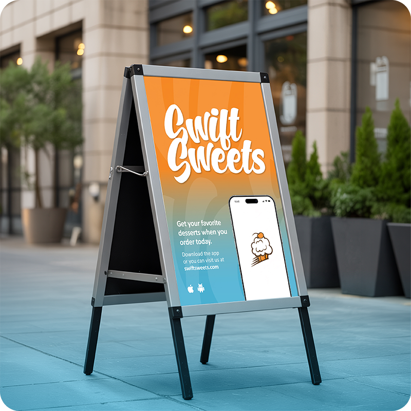
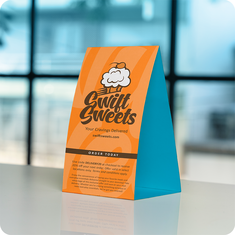
I created this brand with the vision of developing a delivery service dedicated exclusively to desserts. I wanted to steer away from traditional food-industry colors, such as red and yellow, which I felt were already oversaturated in the market. Instead, I chose to incorporate shades of orange to maintain the sense of speed, energy, and movement I wanted the brand to communicate.
To give the brand an extra pop, I paired the orange with a bold, light blue that creates a strong visual contrast and helps the colors stand out. I also wanted to incorporate brown, but only as an accent color. This was intentional, as I didn't want the brand to be associated too heavily with chocolate or any one particular type of dessert. Overall, the goal was to create a color palette that feels energetic, eye-catching, and distinct within the dessert delivery market.